I don’t think I’m alone when, as an author, I find it very exciting when it comes to covers for my books. Sometimes I have a good idea how I would like the cover to look and other times, it’s just a vague mix of ideas instigated by different scenes in the book, usually the major scenes where something important happens. Very rarely does my imagination come anywhere near the end result my publisher presents to me. I have to say it’s at this point I realise why I’m a writer rather than a graphic designer. They have a knack of capturing the essence of the story with one image.
Up until this point, all my books have had the same cover for the English language editions, whether it’s UK, Canada, USA etc and often the foreign editions take on the same cover too or a slight variation. I always find this a fascinating insight into what works for the different countries. However, with The Dead Wife, I was first presented with the cover of a woman’s shoe in a puddle and it sat nicely alongside my previous book cover of a trainer.


I was very happy and fully on-board with this cover. However, when my publishers took it to their US colleagues, they weren’t so sure it worked for their market. I don’t know the ins and outs of the conversations, but it was agreed some alternatives would be put together. My editor sent me the two covers they were going to present to the US office and asked me for my feedback.


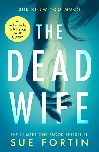
I must admit I was taken with both of them and it was really hard to say which one I preferred. My knee-jerk reaction was the ‘hand in the water’ cover but then when I sat down and took a more considered view on the merits of each, I kept changing my mind. Eventually, I emailed my editor back and said my gut feeling was the ‘hand in the water’ cover and she agreed with me. In fact, she went on to say, they were so taken with the new images, they were thinking of changing the UK cover too.
To cut a long story short, the red shoe was discarded and the new UK cover – the ‘hand in the water’ – replaced it. I assumed this would be the same for the US office too, so was surprised to see they had gone for the ‘face’ cover. It’s obviously a design they think works best for their market and I’m not the expert here so I really have no objections at all.
Of course, this late change in the day meant a mad scramble over the weekend to redesign the promo images I’d prepared, change scheduled blog posts, contact bloggers who were hosting me over the next couple of weeks and let the blog tour organiser know so she could in turn let her contacts know.
So, although it’s caused some extra work – apologies to those who’ve been affected – I’m really happy with the changes and having the two different covers, I feel I’m getting the best of both worlds.
The Dead Wife publishes on 12th July in the UK but unfortunately, readers in the US will have to wait until a bit later in the year.